
Branding
The Brand.
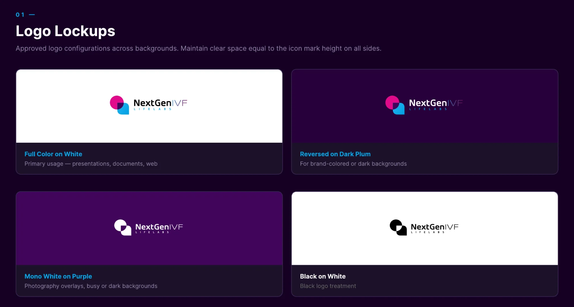
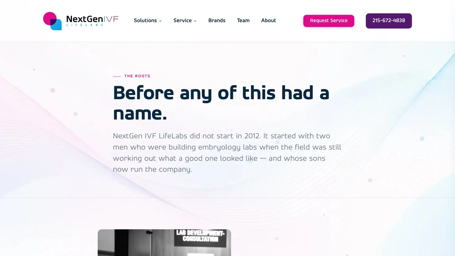
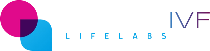
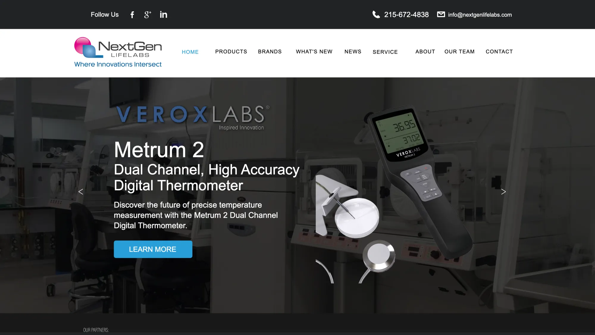
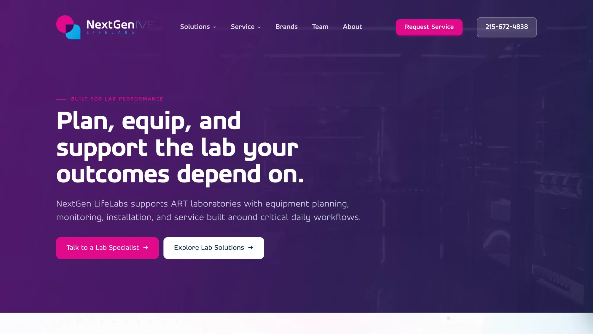
Before a single page, an identity. The name got its IVF back: NextGen IVF LifeLabs. The mark is two forms laid over each other, a pink circle and a cyan leaf, and where they overlap, a deep purple of its own.
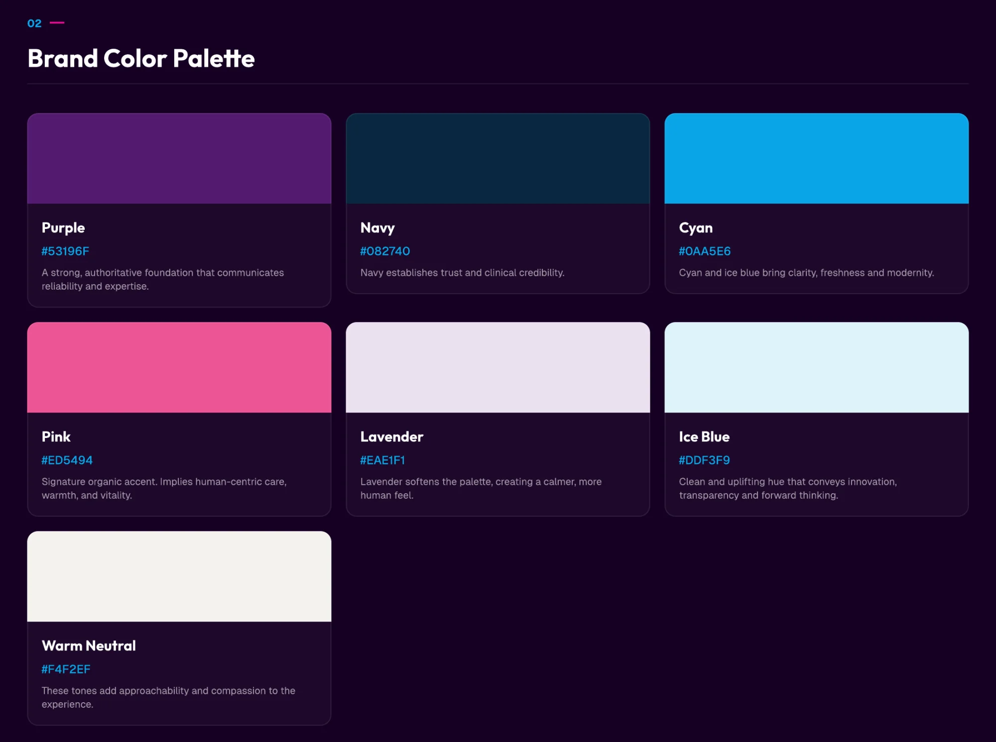
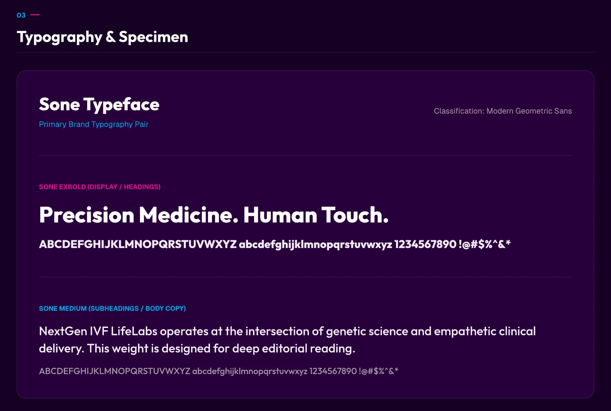
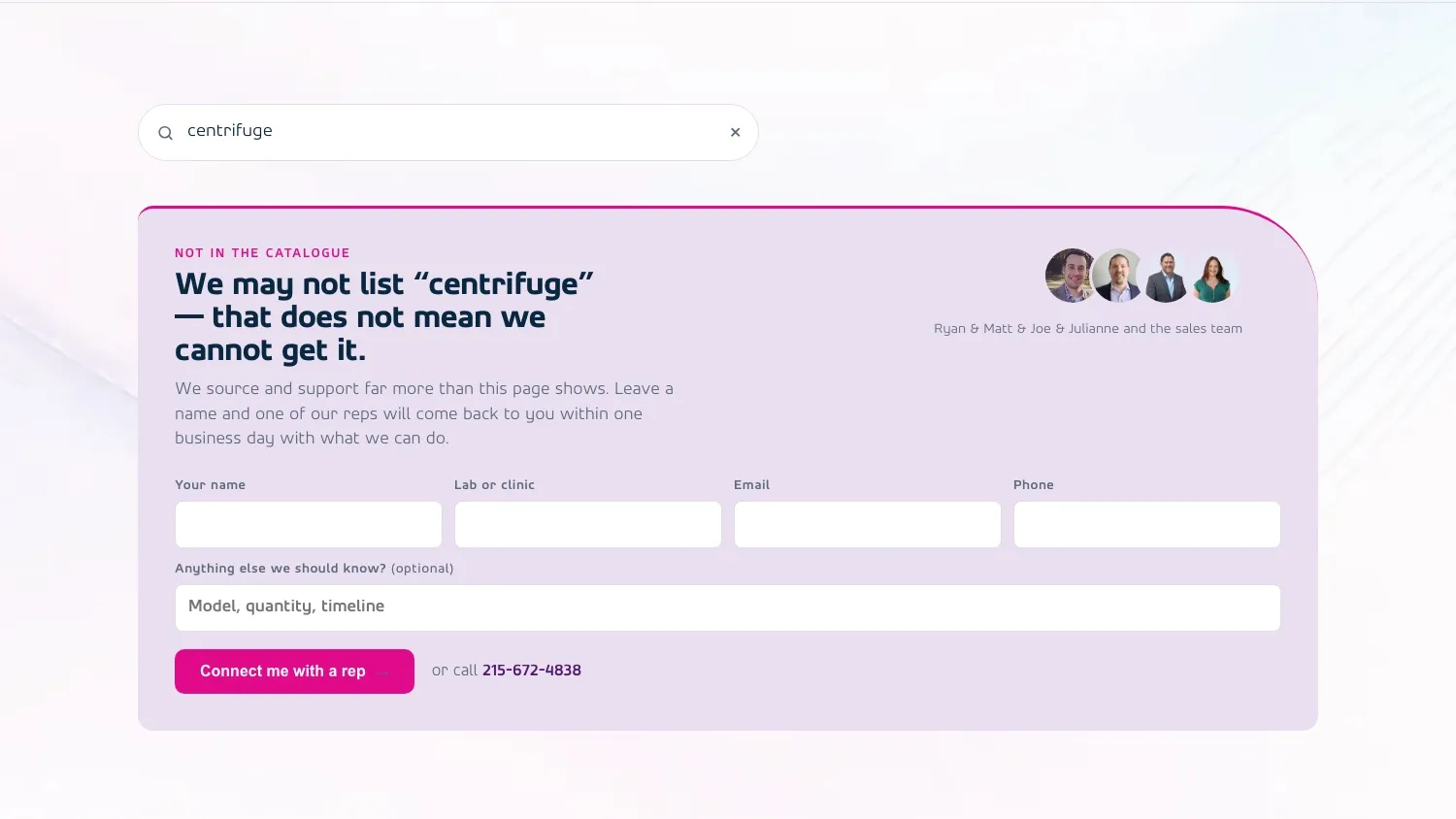
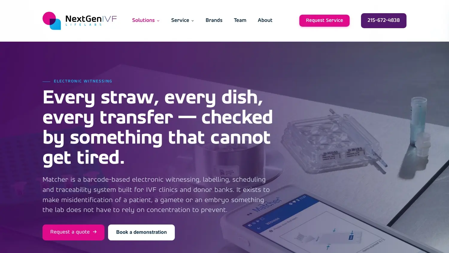
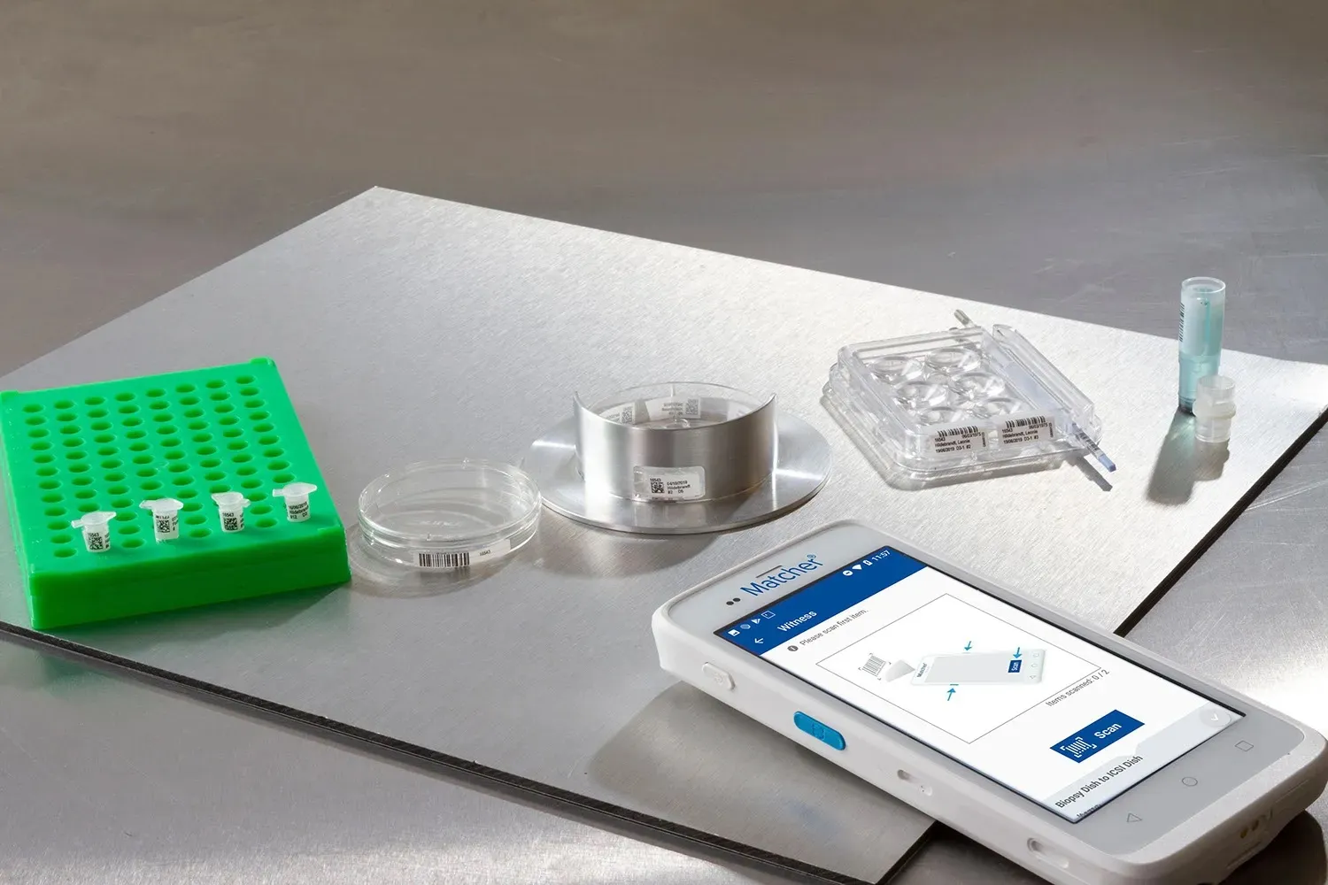
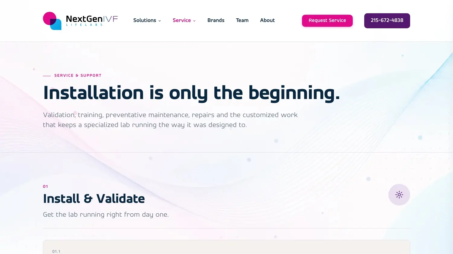
Seven colours, each with a job. Purple for authority, navy for clinical credibility, cyan for links and every call to action, and pink, used sparingly, for the human warmth the work is really about. Sone carries the type. The voice is written down too: quiet, precise and specific, scientific validity over marketing hype, and no stock photos of smiling scientists.
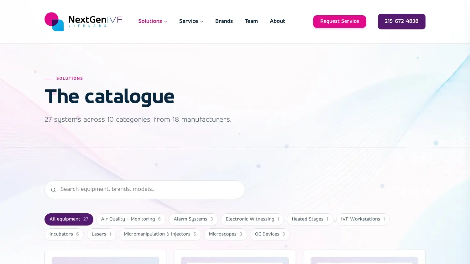
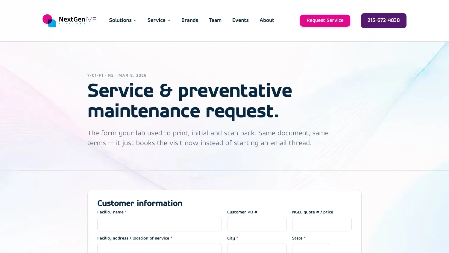
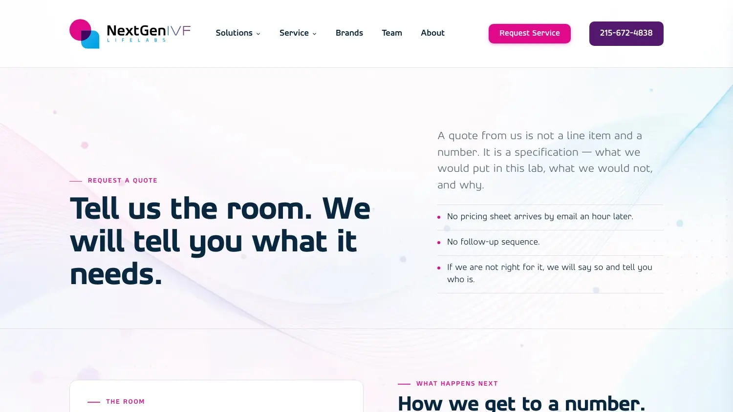
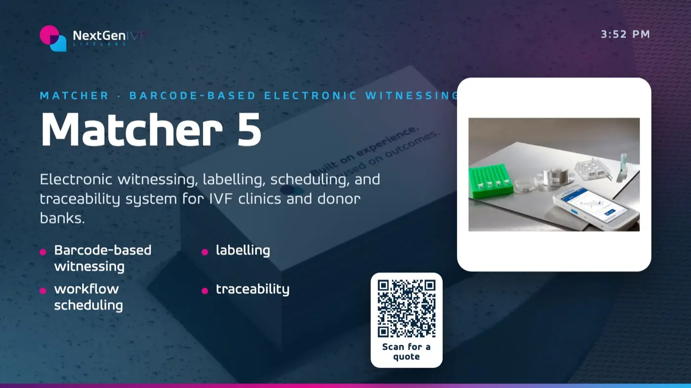
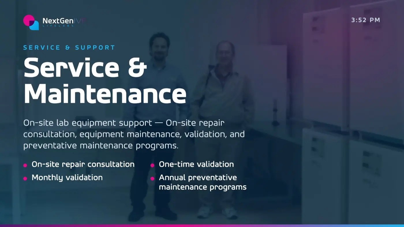
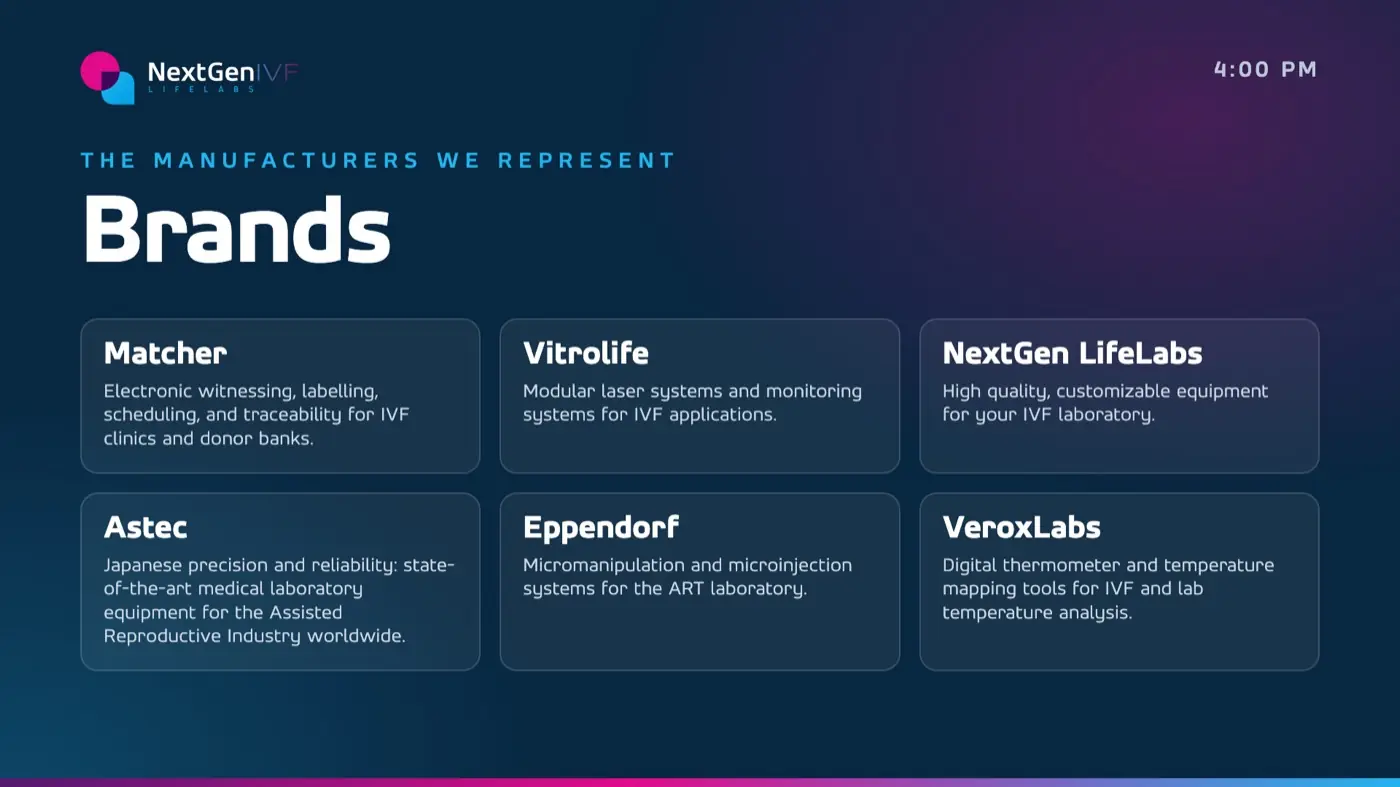
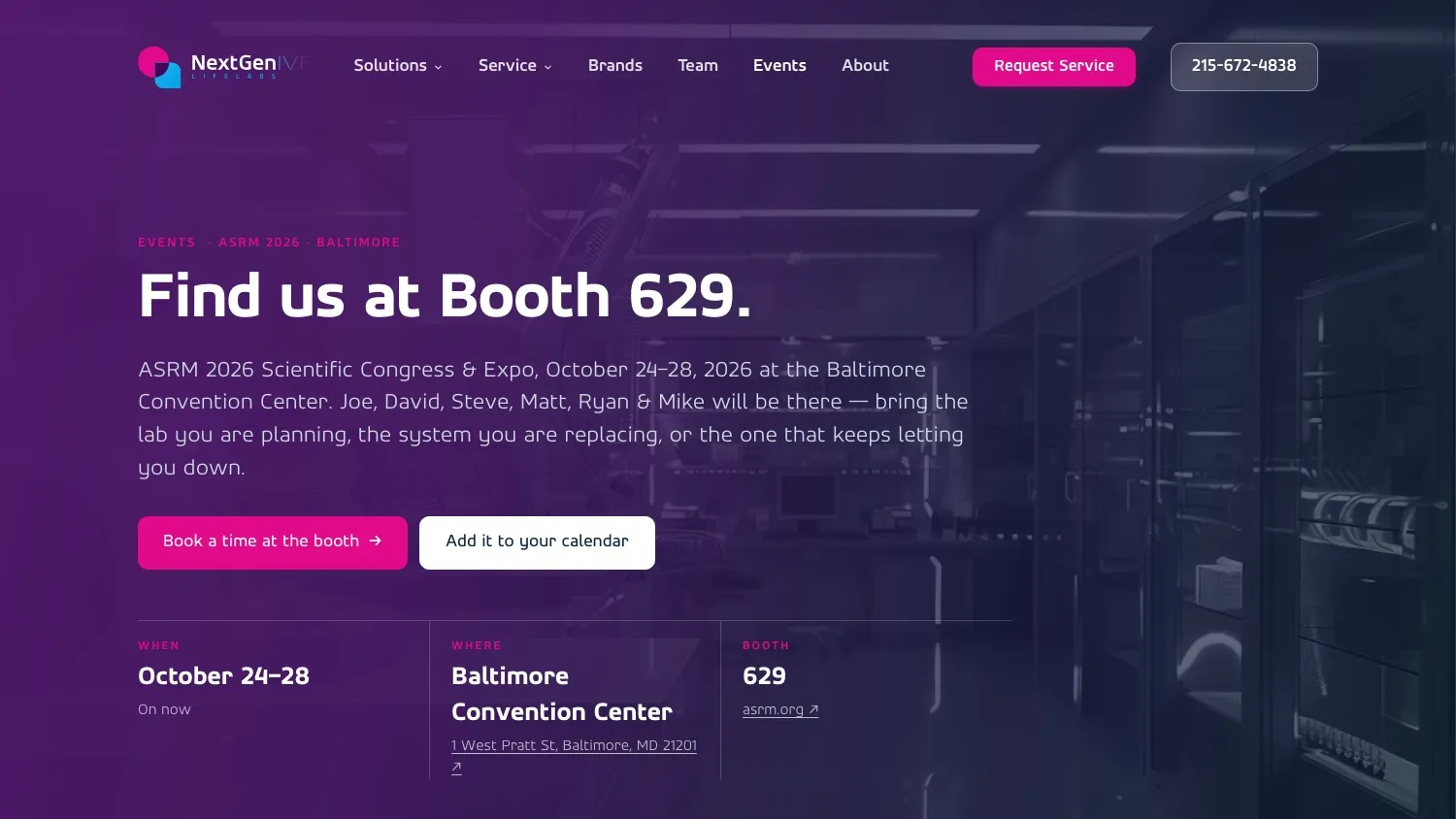
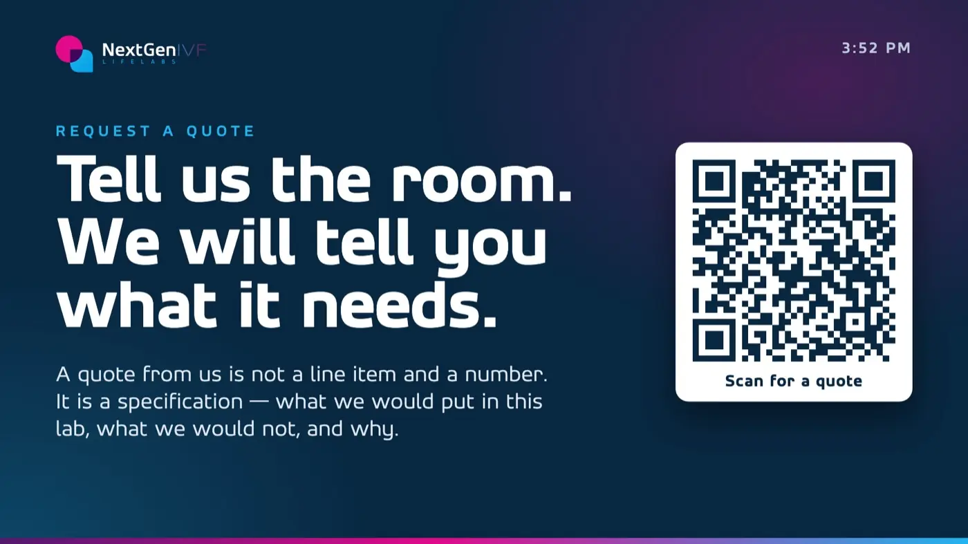
Then the brand went everywhere the company shows up: the site, the booth screens, email signatures with a strip for the next show, and business cards set up for print with a QR code that saves the rep to your phone.